Joining, Reshaping, and Visualizing Data
In this tutorial, we will learn about joining data with
dplyr, pivoting data frame with tidyr, and
data visualization with ggplot2. These three packages are
the most widely used packages within the tidyverse for data
analysis.
Click the button below to clone the course R tutorials into your DataCamp Workspace. DataCamp Workspace is a free computation environment that allows for execution of R and Python notebooks. Note - you will only have to do this once since all tutorials are included in the DataCamp Workspace GBUS 738 project.
![]()
Joining Data Frames
To demonstrate joining data, let’s create two simple data frames, one
with customer purchases and the other with product information. The
connection between these two data frames is the product_id
variable.
Within dplyr syntax, product_id is called a
key variable.
Before we can begin, we must load the tidyverse package.
library(tidyverse)purchases <- tibble(customer_id = c(45, 12, 100, 100, 54, 25),
product_id = c(1, 1, 3, 5, 6, 1))
products <- tibble(product_id = c(1, 2, 3, 4, 5, 6),
product_type = c("Tennis ball", "Soccer ball", "Hockey puck",
"Football", "Basketball", "Baseball"),
price = c(1.25, 22.25, 8.75, 15.25, 17.25, 7.25))# View data
purchasesproducts
First we will focus on mutating joins. A mutating join allows you to combine variables from two data frames. Observations are matched by their values on the key variable.
Left Joins
The syntax for a left join is as follows:
left_join(A, B, by = "key")A left join will return all rows from A, and all columns
that appear in both A and B.
Rows in A with no match in B on the key
variable are returned as missing (NA) values.
Rows in A with multiple matches in B will be
duplicated.
Let’s see some examples of left joins.
# Bring in product information to purchases data
left_join(purchases, products, by = "product_id")
# Bring in purchase data to product table
left_join(products, purchases, by = "product_id")
We can also use the select() function to only join a
subset of a data frame.
# Bring in product prices only
left_join(purchases,
          products %>% select(product_id, price),
          by = "product_id")
Right Joins
The syntax for a right join is as follows:
right_join(A, B, by = "key")A right join will return all rows from B, and all
columns that appear in both A and B.
Rows in B with no match in A on the key
variable are returned as missing (NA) values.
Rows in B with multiple matches in A will be
duplicated.
Any right join can also be written as a left join. Let’s see some examples of right joins.
# Bring in product information to purchases data
right_join(products, purchases, by = "product_id")
# Bring in purchase data to product table
right_join(purchases, products, by = "product_id")
Inner Joins
The syntax for an inner join is as follows:
inner_join(A, B, by = "key")An inner join will return all rows from A where there
are matching key values in B, and all columns that appear
in both A and B.
If there are multiple matches between A and B,
all combinations of these matches are returned
Let’s see some examples of inner joins.
# All observations in products and purchases with all combinations
inner_join(products, purchases, by = "product_id")
# Same result, just ordered differently
inner_join(purchases, products, by = "product_id")
Full Joins
The syntax for a full join is as follows:
full_join(A, B, by = "key")A full join will return all rows and all columns from both
A and B. Where there are no matching key
values, an NA is returned.
# Returning all observations in both tables
full_join(products, purchases, by = "product_id")
Next, we will discuss filtering joins. Mutating
joins allowed us to combine variables from two tables, but if matching
key values were not found, then a missing (NA) value was
generated. Filtering joins are desgined to remove data were there are no
matching key values across tables. Also, filtering joins will not
duplicate key values with multiple matches across tables.
Semi Joins
The syntax for a semi join is as follows:
semi_join(A, B, by = "key")A semi join will return all rows from A where there are
matching key values in B, keeping just the columns from
A.
A semi join differs from an inner join. An inner join will return one
row of A for each matching row of B. A semi
join will never duplicate rows of A.
Let’s see some examples of semi joins.
# All rows in products that also appeared in purchases (by product_id)
semi_join(products, purchases, by = "product_id")
# All rows in purchases that also appear in products (by product_id)
semi_join(purchases, products, by = "product_id")Anti Joins
The syntax for an anti join is as follows:
anti_join(A, B, by = "key")An anti join will return all rows from A where there are
no matching key values in B, keeping just the columns from
A.
Let’s see some examples of anti joins.
# All rows in products that did not appear in purchases (by product_id)
anti_join(products, purchases, by = "product_id")
# All rows in purchases that did not appear in products (by product_id)
# We get an empty data frame in this case
anti_join(purchases, products, by = "product_id")
Key Variables With Different Column Names
Often times when joining data frames together, the key variable that
links multiple datasets together may have different names in the various
data frames. See the example data frames below where a unique country
identifier, the ISO3 code, appears as ‘country_code’ in a different
table. To join the sample data frames below, we must specify the input
to the by argument as follows:
by = c("key value name in first table" = "key value name in second table")# Country table 1
countries_1 <- tibble(ISO3 = c("AFG", "IND", "CHN", "USA"),
population_millions = c(37.21, 1368.73, 1420.06, 329.1))
# Country table 2
countries_2 <- tibble(country_code = c("AFG", "IND", "CHN", "USA"),
country_name = c("Afghanistan", "India", "China",
"United States"))
# View data
countries_1
countries_2The code below demonstrates how to join these data frames.
left_join(countries_1, countries_2,
          by = c("ISO3" = "country_code"))
Composite Key Variables
A composite key is a combination of variable values that uniquely
identify a row within a data frame. In the sample data frames that are
created below, the composite keys for patients_1 and
patients_2 are
first_name, last_name, date_of_birth and
first, last, date_of_birth. To join these patient records,
we extend our inputs to the by argument as demonstrated
below.
# patients_1
patients_1 <- tibble(first_name = c("Mia", "Vivian", "Vivian", "Tyler"),
                     last_name = c("Wallace", "Ward", "Ward", "Durden"),
                     date_of_birth = c("05-12-1994", "06-02-1990",
                                       "08-04-1994", "05-28-1999"),
                     gender = c("female", "female", "female", "male"))
# patients_2
patients_2 <- tibble(first = c("Tyler", "Mia", "Vivian", "Vivian"),
last = c("Durden", "Wallace", "Ward", "Ward"),
date_of_birth = c("05-28-1999", "05-12-1994",
"06-02-1990", "08-04-1994"),
blood_pressure = c("140/85", "130/86", "110/72", "120/80"))
patients_1
patients_2
# Combining the data
left_join(patients_1, patients_2,
          by = c("first_name" = "first",
                 "last_name" = "last",
                 "date_of_birth" = "date_of_birth"))
Stacking Data Frames
Stacking Rows
To stack two or more data frames vertically by row, we can use the
bind_rows() function from the dplyr package.
This task is common when an analyst needs to combine data from multiple
sources. For bind_rows() to work properly, all input data
frames should contain the same variables (column names), but not
necessarily in the same order.
In the example below, we have two sample data sets that correspond to sales revenue from two different store locations. Our goal is to place the data into one file which can be used for data analysis in the future.
If we supply input to the optional .id argument of
bind_rows(), it will create an ID variable in the combined
data frame and name that variable with what we have provided. The ID
variable is created as a sequence starting at 1 and ending at the total
number of data frames that are being combined.
# Sample data 1
store_a <- tibble(day = c("Monday", "Tuesday", "Wednesday"),
                  date = c("02-04-2019", "02-05-2019", "02-06-2019"),
                  sales = c(120452, 574632, 329342))
# Sample data 2
store_b <- tibble(day = c("Monday", "Tuesday", "Thursday"),
date = c("02-04-2019", "02-05-2019", "02-07-2019"),
sales = c(750452, 974332, 527342))
store_a
store_b
combined_data <- bind_rows(store_a, store_b,
                           .id = "store")
# View results
combined_data
# Without creating an ID variable
bind_rows(store_a, store_b)
Stacking Columns
To stack two or more data frames horizontally by columns, we can use
the bind_cols() function from the dplyr
package.
# Store A profit
store_a_profit <-tibble(profit = c(80578, 420145, 247587))
# Add this column to store_a data frame
store_a_combined <- bind_cols(store_a, store_a_profit)store_a_combined
Reshaping Data
The tidyr package is useful for transforming data frames
from long and wide formats based on key-value pairs. The functions we
will be using from tidyr include pivot_wider()
and pivot_longer().
Intuitively, pivot_wider() is used to transform the
values of a data frame variable into multiple columns (long to wide
format). Conversely, pivot_longer() is used to collapse
multiple columns into a single variable (wide to long format).
The tidyr package contains 5 sample data frames,
table1, table2, table3,
table4a, and table4b, that have the same data
on the prevalence of a disease in Afghanistan, Brazil, and China (just
in different formats). They are loaded to your R session
when you import the tidyverse package.
Long to Wide
To demonstrate the pivot_wider() function, we will be
working with the table2 data frame. Let’s first have a look
at the data.
table2The pivot_wider() function takes many arguments as
input, but the 4 most important ones are listed below.
data- a data frame to pivot
names_from- the quoted column name indatawhose distinct values will be spread into multiple columns
values_from- the quoted column name indatawith the corresponding values associated with thenames_fromcolumnvalues_fill- default isNA. If a name-value pair is missing, this is what the result is filled with
Let’s see an example. The figure below is a visualization of the
pivot_wider() function applied to the table2
data frame. Here we pivot the unique values of the type
variable into their own columns and fill them with the corresponding
values from the count column.
# Pivot unique values of "type" variable into multiple columns

pivot_wider(table2, names_from = 'type', values_from = 'count')
Wide to Long
When it is your goal to convert from wide to long format, use the
pivot_longer() function. The pivot_longer()
function takes a data frame and collapses multiple columns into a single
column.
The pivot_longer() function takes many arguments as
input, but the 4 most important ones are listed below.
data- a data frame to pivotcols- a vector of columns names (either quoted or raw) to pivot into a single variablenames_to- a string specifying the name of the column to create from the columns in thecolsargument
values_to- a string specifying the name of the column to create from the associated values of the columns in thecolsargument
To demonstrate the pivot_longer() function we will be
using table1.
This table contains the same data as table2, just in a
different format.
# View the data
table1
Let’s say that we need to collect the cases and
population columns into a single column that we want to
name value_type and the associated values into a column
named total_count. The code below achieves this task.
pivot_longer(table1, cols = c(cases, population),
             names_to = 'value_type',
             values_to = 'total_count')
The tidyr package can be used to perform a wide range of
complex data re-structuring tasks. This is an important skill to develop
if you plan on working with data and I recommend that you go through all
of the examples in the tidyr documentation
Data Visualization
This section will cover the basics of data visualization with
ggplot2. Most of the data visualizations that you will be
required to produce follow the same general template, displayed
below.
To create different types of graphics with ggplot2, such
as scatter plots or bar graphs, you will only need to adjust the input
in brackets with the appropriate input or functions.
ggplot2 makes use of the + operator. This
is not the addition operator that is used in base
R.
Since ggplot2 was created before dplyr, the
+ operator was used instead of the %>%
operator, but within ggplot2, the + operator
functions the same way as %>% functions in
dplyr.
ggplot(data = [DATA], mapping = aes([MAPPING]) +
         [GEOM_FUNCTION]() +
         [FACET_FUNCTION]() +
         [COORDINATE_FUNCTION]() +
         labs(title = [TITLE],
              x = [X AXIS LABEL],
              y = [Y AXIS LABEL])
We will be creating data visualizations using a data frame that
contains information on patients in a heart disease study. The data is
loaded with the code below. Each row in this data frame represents a
patient and their outcomes on medical tests. Each patient eventually did
or did not develop heart disease. This is captured by the
heart_disease variable.
heart_df <- readRDS(url('https://gmubusinessanalytics.netlify.app/data/heart_disease.rds'))

# View the data
heart_df
Scatter Plots
Simple Scatter Plot
I will introduce each bracketed parameter in the template above by building a series of scatter plots that adds on each layer. We will be using the Heart Disease data set.
The code below produces a simple scatter plot. The data parameter in
ggplot() takes the data frame that contains your data. The
aes() option in the mapping parameter stands for aesthetic
mapping.
Below we are telling ggplot() to map the
age column values in heart_df to the x-axis
and the cholesterol column values to the y-axis. This
produces (x,y) pairs that are mapped to coordinates on the graph.
Finally, we add the geom_point() function which tells
ggplot that you would like points to be displayed on the
coordinate mappings you have created.
ggplot(data = heart_df, mapping = aes(x = age, y = cholesterol)) +
       geom_point()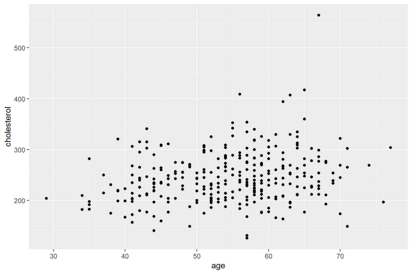
All geom functions take optional aesthetic values. These
include, color, size, and alpha
(to control opacity). When these parameters are placed within a
geom function and outside of the aes argument,
they are applied to all points. You can specify the
name of a color in R such as “orange” or by supplying a HEX
code as I did below.
Below, I am styling the points to have size 2, a blue color using the HEX code #006EA1, and 45% opacity.
ggplot(data = heart_df, mapping = aes(x = age, y = cholesterol)) +
       geom_point(color = "#006EA1", size = 2, alpha = 0.45)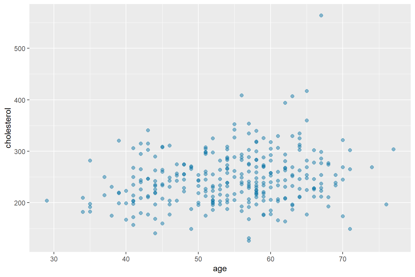
Adding a Third Variable With aes()
Now we want to visualize the scatter plot by groups, those with heart disease and those without.
We can color the points by the value of the
heart_disease variable as follows. Add
color = heart_disease inside of the aes
function within the mapping. This adds to the original mapping that we
provided to ggplot().
Now we have mapped each point to three attributes (age,
cholesterol, color based on heart_disease
value).
ggplot(data = heart_df, mapping = aes(x = age, y = cholesterol, color = heart_disease)) +
       geom_point()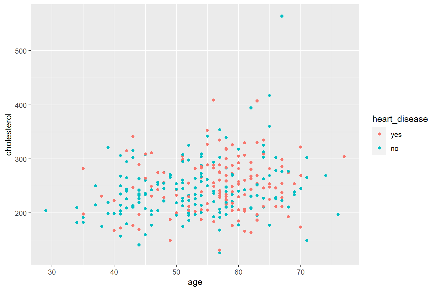
Adding a Third Variable by Facet
We can also visualize a third variable by adding the
facet_wrap() function.
This function separates the scatter plot based on the value of
heart_disease.
The general syntax is
facet_wrap( ~ Your_facet_variable, nrow = rows_you_would_like).
ggplot(data = heart_df, mapping = aes(x = age, y = cholesterol)) +
       geom_point() +
       facet_wrap(~ heart_disease, nrow = 2)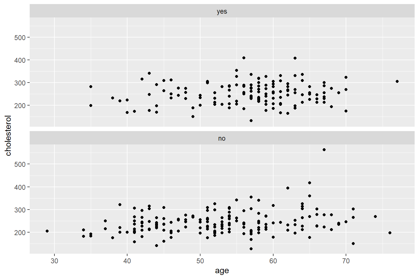
If you would like to keep the heart_disease values as
different colors, just add color = heart_disease into
aes.
Below I demonstrate what changing the nrow option will
do to your plot.
ggplot(data = heart_df, mapping = aes(x = age, y = cholesterol, color = heart_disease)) +
      geom_point() +
      facet_wrap(~ heart_disease, nrow = 1)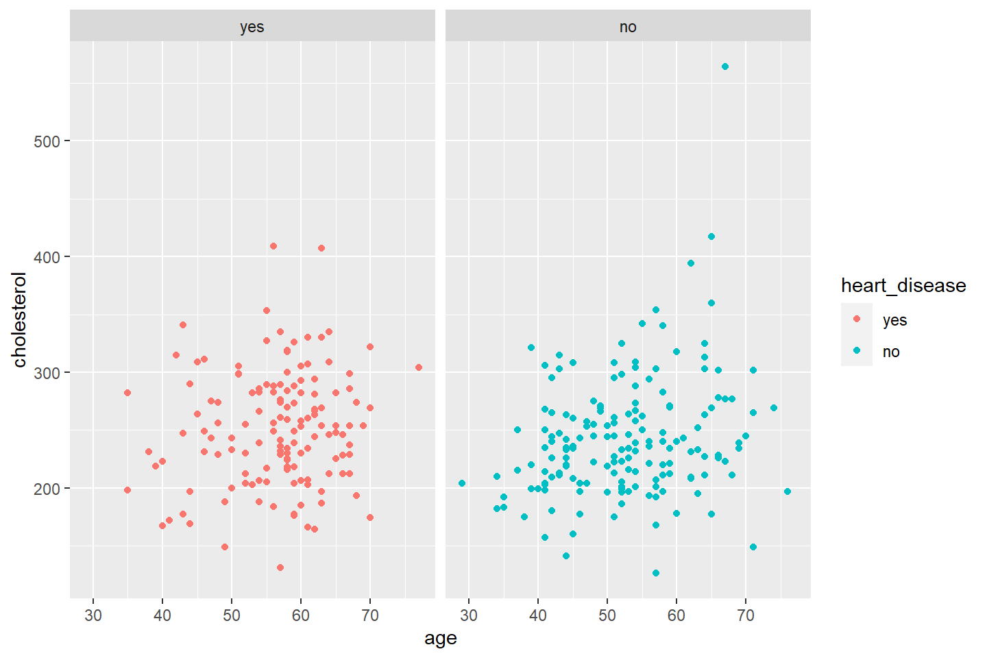
Adding a Fourth Variable by Facet
We can visualize the scatter plot by combinations of character or
factor variables. If you are faceting by more than one variable, use the
facet_grid() function.
The general syntax for facet_grid() is
facet_grid(Vertical_variable ~ Horizontal_variable)ggplot(data = heart_df, mapping = aes(x = age, y = cholesterol, color = heart_disease)) +
geom_point() +
facet_grid(heart_disease ~ fasting_blood_sugar)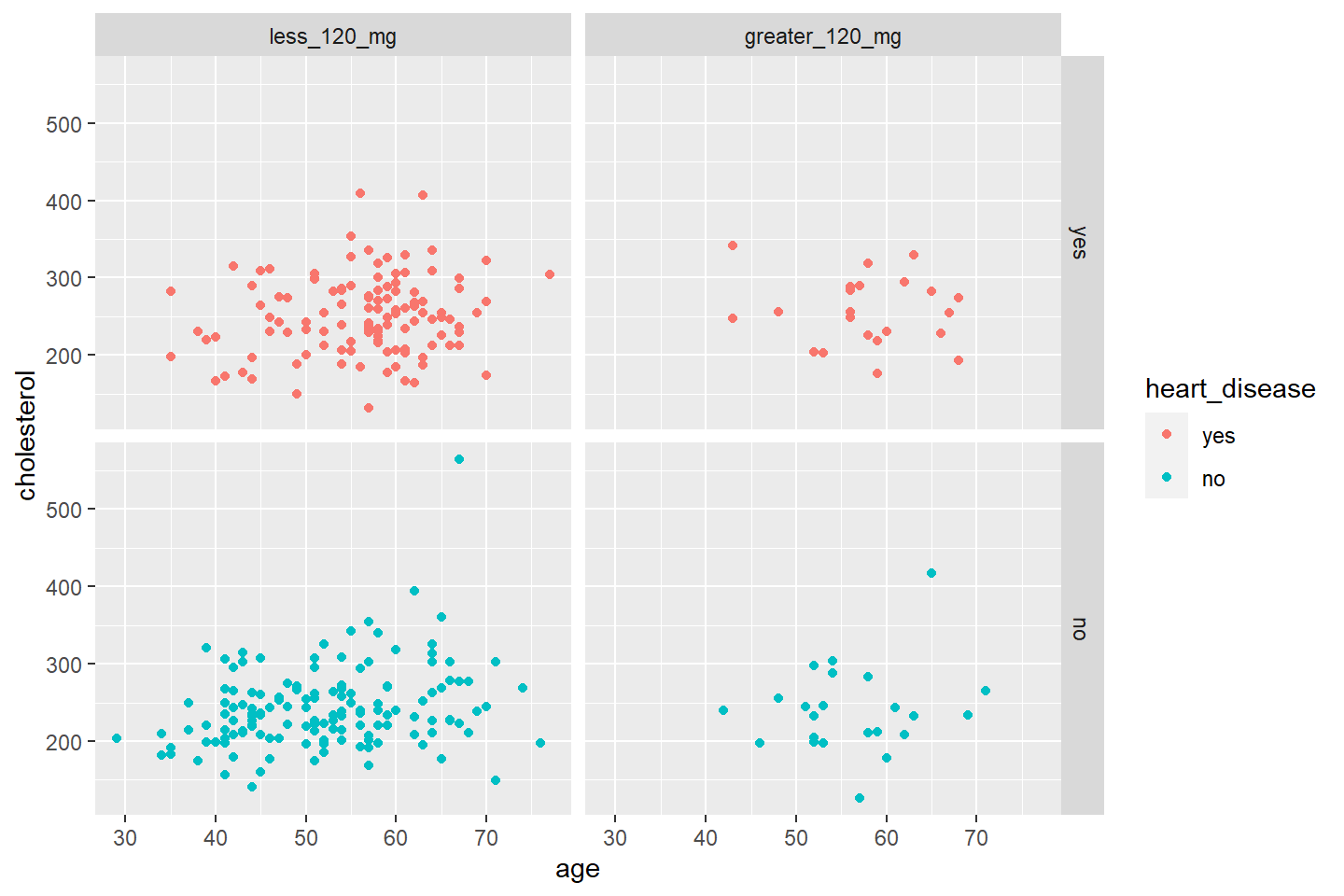
Finally, let’s change the title and labels of our plot.
ggplot(data = heart_df, mapping = aes(x = age, y = cholesterol, color = heart_disease)) +
       geom_point() +
facet_grid(heart_disease ~ fasting_blood_sugar) +
labs(title = "Cholesteral vs Age by Heart Disease and Fasting Blood Sugar Levels",
x = "Patient Age",
y = "Patient Cholesterol")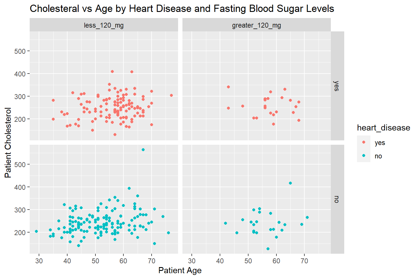
Bar Charts
Now that we have gone through the layers of the template, let’s see what adjustments are needed to create a bar chart.
Let’s visualize the number of patients with and without heart
disease. Now our aes mapping in ggplot() only
has one variable, heart_disease.
To produce a bar chart, we use the geom_bar() function.
The stat = "count" option tells ggplot() to
transform the heart_disease column values and generate the
counts for each level, Yes or No.
ggplot(data = heart_df, mapping = aes(x = heart_disease)) +
       geom_bar(stat = "count")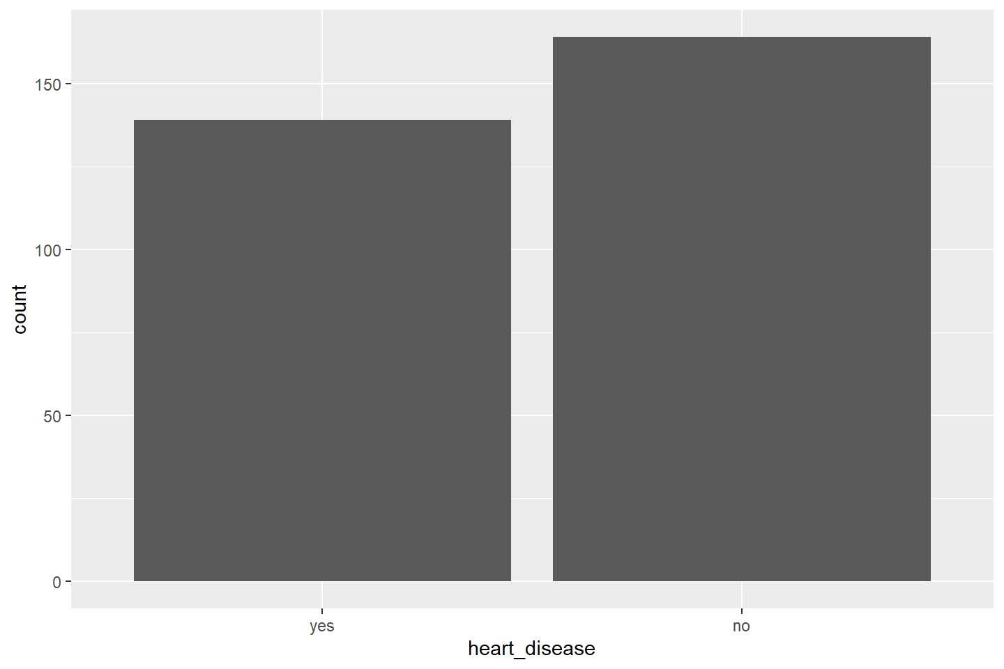
In the graph above, behind the scenes ggplot() is
computing the following transformation to obtain the counts for each
level of heart_disease.
heart_df %>% group_by(heart_disease) %>%
             summarise(count = n())
If you wanted to compute the summary statistics yourself, you could do the following.
Using dplyr, create a summary data frame,
heart_summary, that has two variables,
heart_disease and count. The
count variable will have the number of patients that belong
to the corresponding value of heart_disease.
Next, you must add y = count into the aes
option in ggplot(). This tells ggplot() that
you want to plot two pairs of coordinates (heart_disease value, count
for heart_disease value). In this example, (No, 160), and (Yes,
137).
Finally, you must change stat = "count" in
geom_bar() to stat = "identity"
heart_summary <-  heart_df %>%
                  group_by(heart_disease) %>%
                  summarise(count = n())
#View results
heart_summary# Plot the data, same as before
ggplot(data = heart_summary, mapping = aes(x = heart_disease, y = count)) +
geom_bar(stat = "identity")
Let’s use this same methodology to plot a bar chart of average
old_peak, by chest_pain. This time, let’s make
the bars blue with a white border and add text labels. To change the bar
color for all bars, use the fill option within
geom_bar(). To change the border color, use
color.
oldpeak_summary <- heart_df %>% group_by(chest_pain) %>%
                   summarise(avg_oldpeak = mean(old_peak))
# View results
oldpeak_summary# Plot the data
ggplot(data = oldpeak_summary, mapping = aes(x = chest_pain, y = avg_oldpeak)) +
geom_bar(stat = "identity", fill = "#006EA1", color = "white") +
labs(title = "Average Old Peak by Chest Pain",
x = "Chest Pain",
y = "Average Old Peak")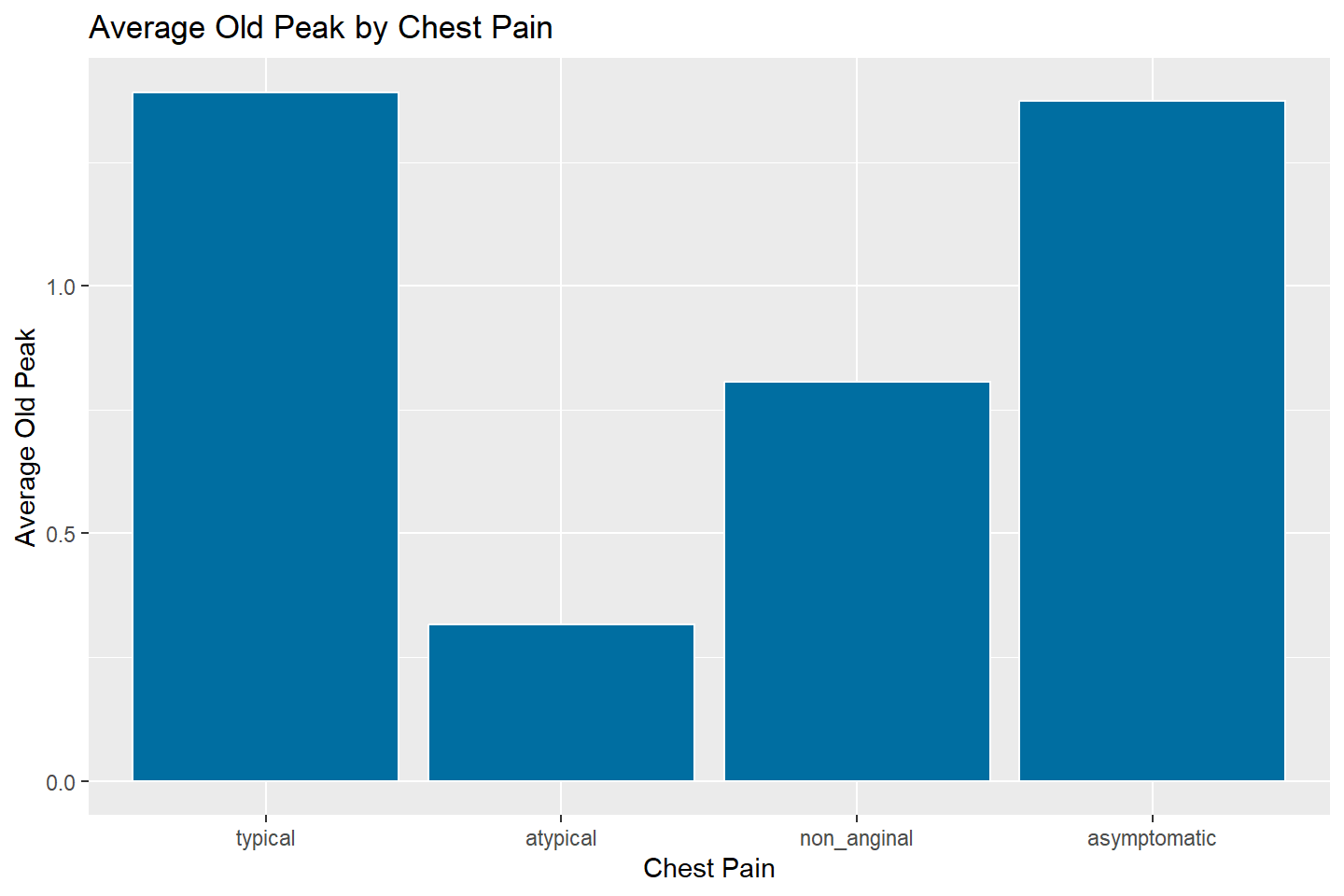
Reorder The Categories of a Bar Chart with reorder()
To reorder the categorical values of either the x or y axis on a bar
chart, we can use the reorder() function from base
R.
The reorder() function has two required arguments - a
vector of values in the first argument and another vector of values of
equal length as the second argument by which to sort the first. Let’s
see some examples below.
 ggplot(data = oldpeak_summary, mapping = aes(x = reorder(chest_pain, avg_oldpeak),
                                              y = avg_oldpeak)) +
        geom_bar(stat = "identity", fill = "#006EA1", color = "white") +
        labs(title = "Average Old Peak by Chest Pain",
             x = "Chest Pain",
             y = "Average Old Peak")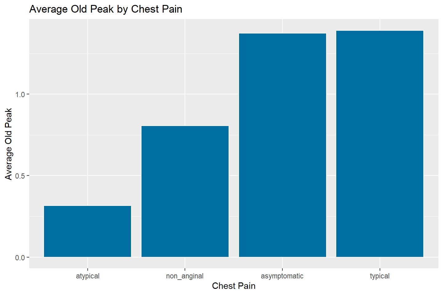
# To sort values in reverse order, simply put a minus (-) in
# front of the second variable
ggplot(data = oldpeak_summary, mapping = aes(x = reorder(chest_pain, -avg_oldpeak),
                                              y = avg_oldpeak)) +
        geom_bar(stat = "identity", fill = "#006EA1", color = "white") +
        labs(title = "Average Old Peak by Chest Pain",
             x = "Chest Pain",
             y = "Average Old Peak")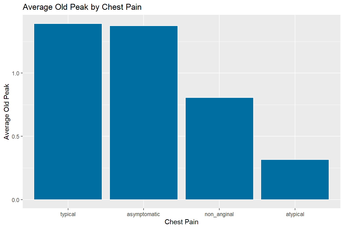
Let’s go back to our original bar chart that showed the number of
patients with and without heart disease. If we wanted to color the bars
by heart_disease value, we can perform the same step as
with the scatter plot. Now we add fill = heart_disease into
the aes mapping.
When you add the fill option into aes it
updates the aesthetic mapping to include three dimensions for each bar
(heart_disease value, count, fill color of
heart_disease value).
ggplot(data = heart_df, mapping = aes(x = heart_disease, fill = heart_disease)) +
       geom_bar(stat = "count") +
       labs(title = "Heart Disease Prevalence", x = "Heart Disease Status",
            y = "Number of Patients")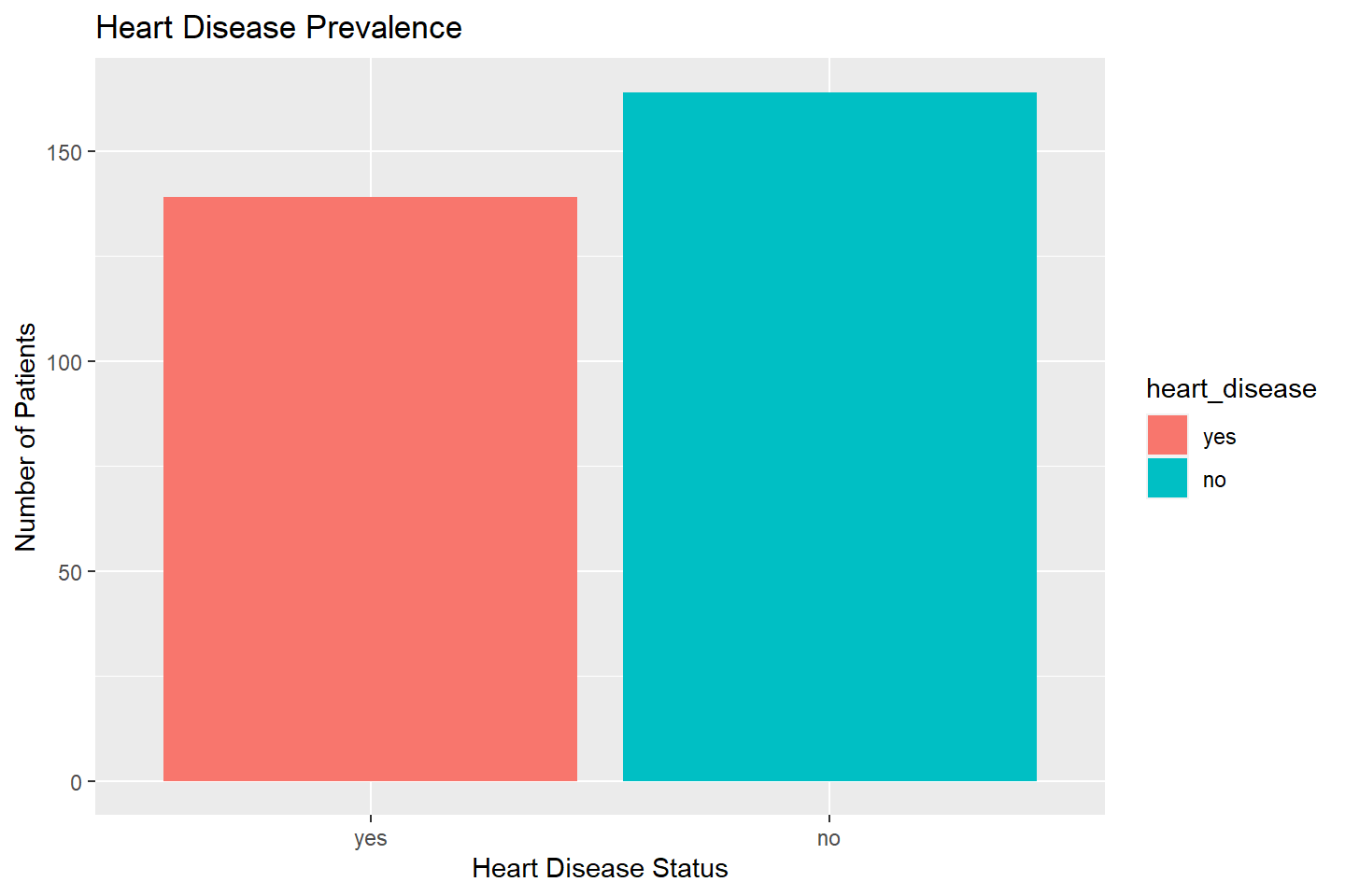
Adding a Facet Variable
We can add a facet variable in the same way as we did with the
scatter plot example, by adding facet_wrap()
ggplot(data = heart_df, mapping = aes(x = heart_disease, fill = heart_disease)) +
       geom_bar(stat = "count") +
       facet_wrap(~ chest_pain, nrow = 1) +
       labs(title = "Heart Disease Prevalence by Chest Pain", x = "Heart Disease Status",
            y = "Number of Patients")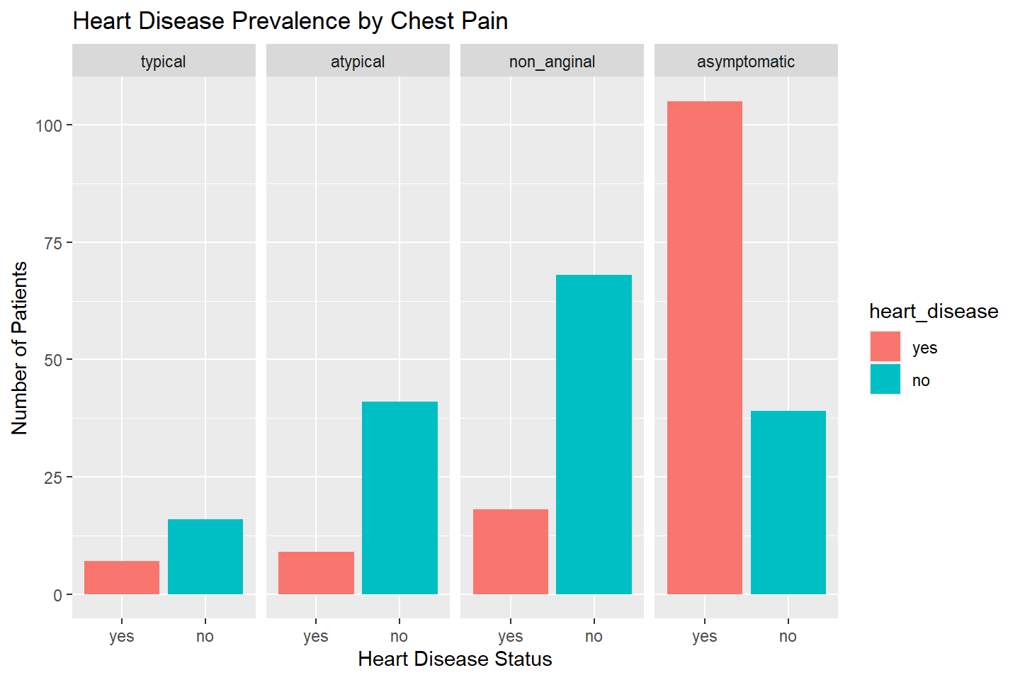
Stacked Bar Charts
If we add a variable to aes(fill = ) that is different
from the variable mapped to the x-axis, then we create a stacked bar
chart.
The variable which we add to the fill option in
aes, will add a color based on the level of that variable
and will display its width by the number of observations in the
data.
Below we create a stacked bar chart by adding the
chest_pain variable.
ggplot(data = heart_df, mapping = aes(x = heart_disease, fill = chest_pain)) +
       geom_bar(stat = "count") +
       labs(title = "Heart Disease Prevalence by Chest Pain",
            x = "Heart Disease Status",
            y = "Number of Patients")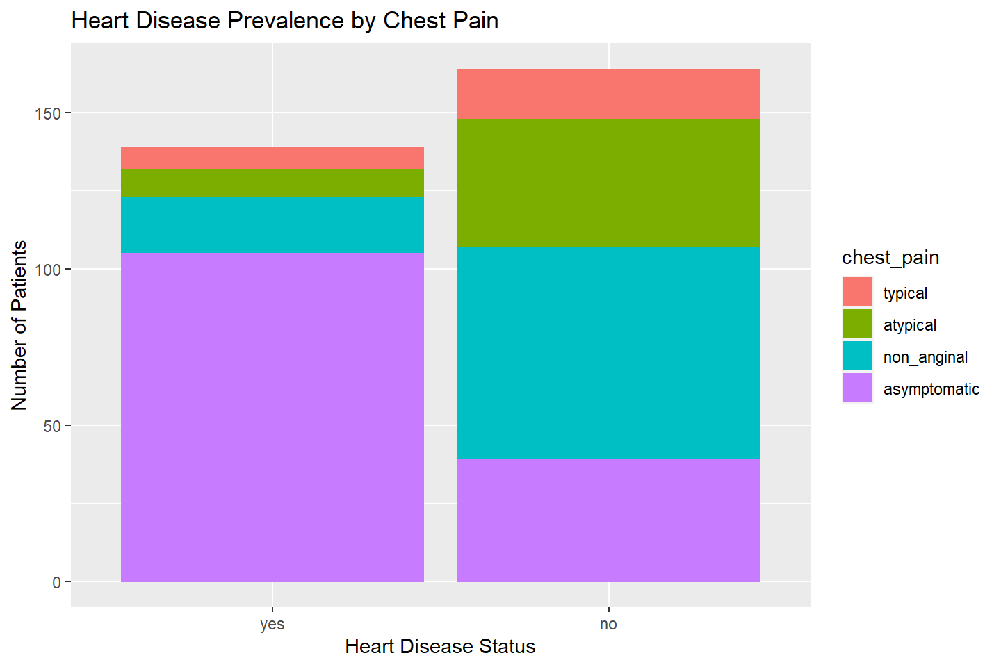
We can also create a 100 percent stacked column chart by adding
position = "fill" into geom_bar(). This will
display the proportion of observations that fall into the various values
of chest_pain within each heart_disease
value.
ggplot(data = heart_df, mapping = aes(x = heart_disease, fill = chest_pain)) +
       geom_bar(stat = "count", position = "fill") +
       labs(title = "Heart Disease Prevalence by Chest Pain",
            x = "Heart Disease Status",
            y = "Proportion of Patients")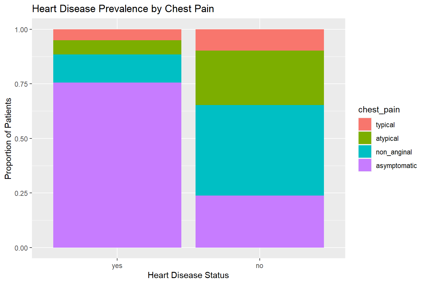
Stacking Bars Side by Side
A third option for working with stacked bar plots is to add
position = "dodge" within geom_bar() to stack
bars side by side.
These type of plots are usually used to compare multiple values or proportions that are changing over time.
Let’s apply this style to our visualization of
heart_disease and chest_pain.
ggplot(data = heart_df, mapping = aes(x = heart_disease, fill = chest_pain)) +
       geom_bar(stat = "count", position = "dodge") +
       labs(title = "Heart Disease Prevalence by Chest Pain",
            x = "Heart Disease Status",
            y = "Number of Patients")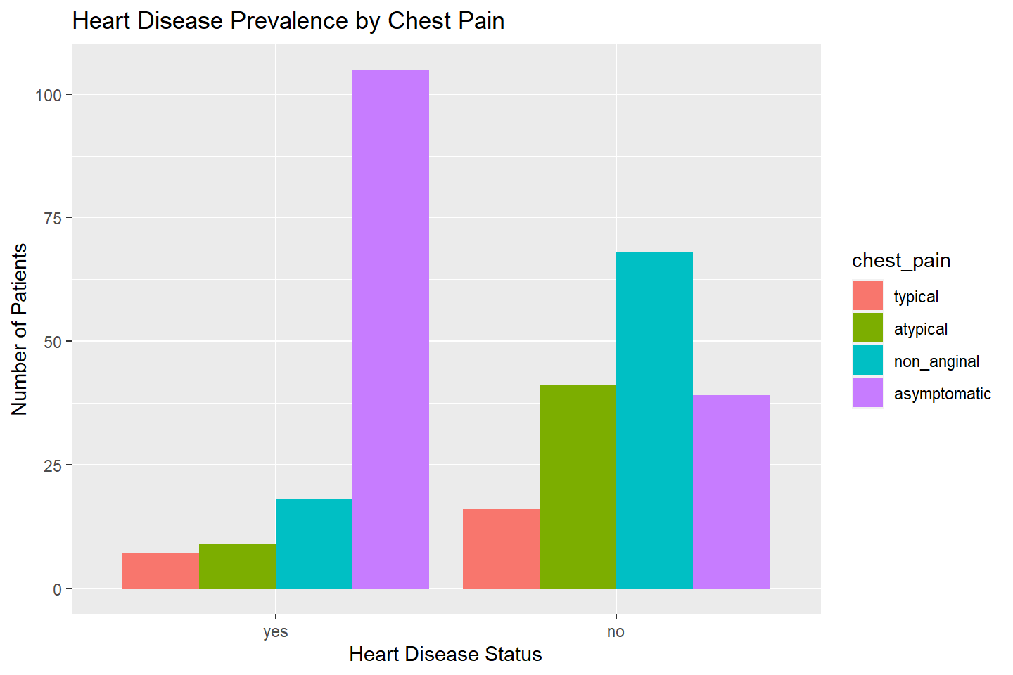
Column Charts
To obtain a column chart, we can first build a bar chart and then use
the coord_flip() function to flip the x and y axes. In the
example below, we first build a bar chart and then take the necessary
steps to build a column chart.
Build a Bar Chart
ggplot(data = heart_df, aes(x = fasting_blood_sugar, fill = heart_disease)) +
    geom_bar(stat = "count") +
    labs(title = "Fasting Blood Sugar Level by Heart Disease Status",
         x = "Fasting Blood Sugar", y = "Number of Patients")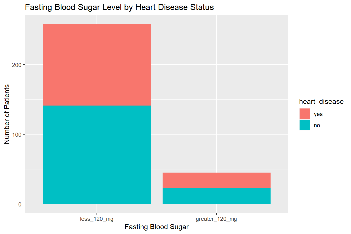
Flip The Axes With coord_flip()
ggplot(data = heart_df, aes(x = fasting_blood_sugar, fill = heart_disease)) +
    geom_bar(stat = "count") +
    labs(title = "Fasting Blood Sugar Level by Heart Disease Status",
         x = "Fasting Blood Sugar", y = "Number of Patients") +
    coord_flip()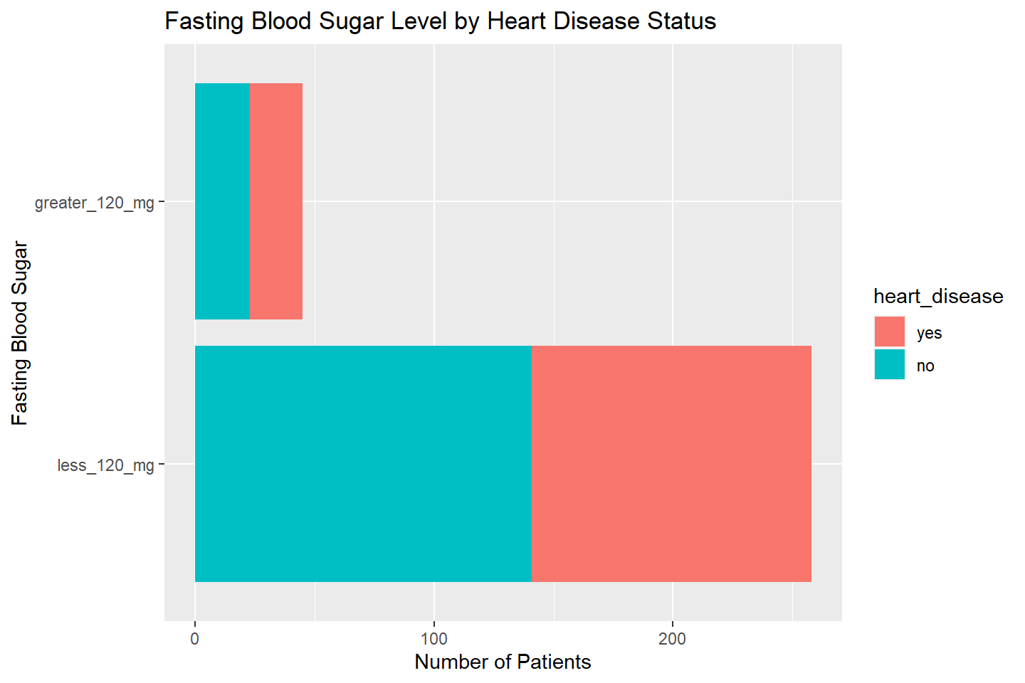
Histograms
Histograms are used to visualize the distribution of continuous
variables. They automatically create a series of bins that
combine the values of a numeric variable into categories. Then the
number of times the original values fall into these bins is counted and
displayed as a vertical bar. These graphs are used to visually assess
the properties of numeric variables, such as symmetry, skewness,
variability, and central tendency.
To create a histogram, use the geom_histogram()
function. In the example below I have added
fill = "#006EA1" and color = "white" inside
the geom_histogram() function. The fill option
specifies the bar color, while the color option specifies
the border color of the bars, just as in bar charts.
ggplot(data = heart_df, mapping = aes(x = resting_blood_pressure)) +
       geom_histogram(fill = "#006EA1", color = "white") +
       labs(title = "Distribution of Resting Blood Pressure",
            x = "Resting Blood Pressure",
            y = "Number of Patients")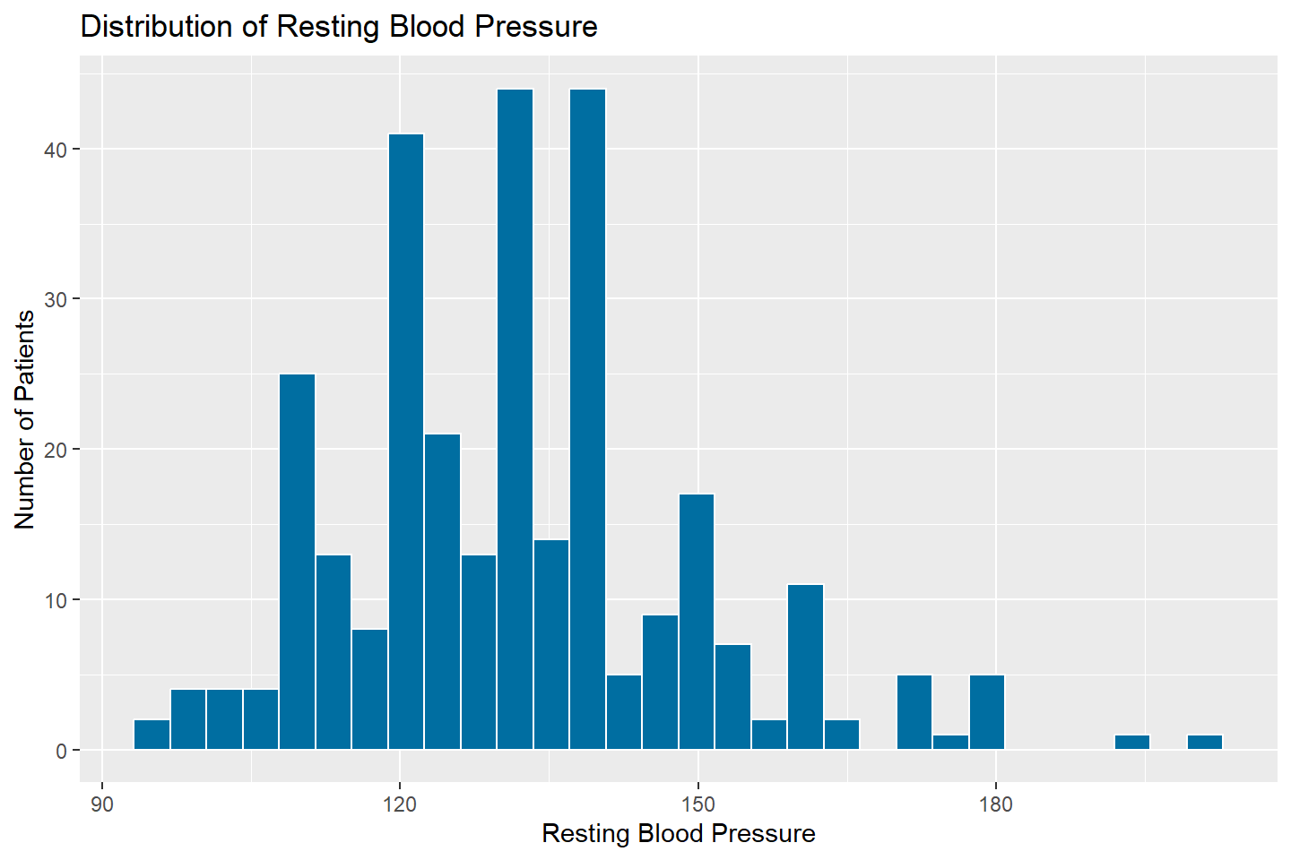
The default number of bins for histograms is set to 30. To change
this, adjust the bins option within the
geom_histogram() function. In the example below, the
histogram is created using 15 bins for the RestBP
variable.
ggplot(data = heart_df, mapping = aes(x = resting_blood_pressure)) +
      geom_histogram(fill = "#006EA1", color = "white", bins = 15) +
      labs(title = "Distribution of Resting Blood Pressure",
           x = "Resting Blood Pressure",
           y = "Number of Patients")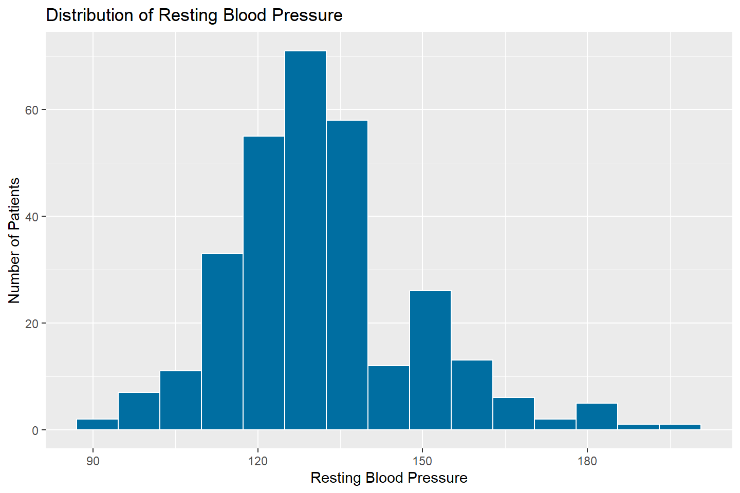
Adding Additional Variables to Histograms
Let’s look at the distribution of resting_blood_pressure
by the heart_disease variable. We can do this by faceting.
I demonstrate how to do this with one and two facet variables in the
code below
ggplot(data = heart_df, mapping = aes(x = resting_blood_pressure, fill = heart_disease)) +
       geom_histogram(color = "white", bins = 15) +
       facet_wrap( ~ heart_disease, nrow = 1) +
       labs(title = "Distribution of Resting Blood Pressure",
            x = "Resting Blood Pressure",
            y = "Number of Patients")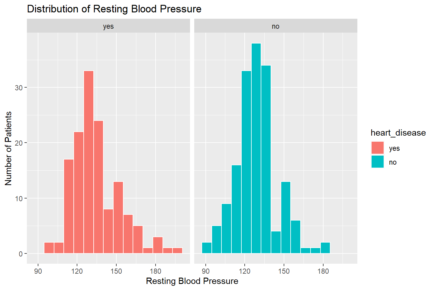
We can use facet_grid() to add another variable to the
visualization, thalassemia.
ggplot(data = heart_df, mapping = aes(x = resting_blood_pressure, fill = heart_disease)) +
       geom_histogram( color = "white", bins = 15) +
       facet_grid(heart_disease ~ thalassemia) +
       labs(title = "Distribution of Resting Blood Pressure",
            x = "Resting Blood Pressure",
            y = "Number of Patients")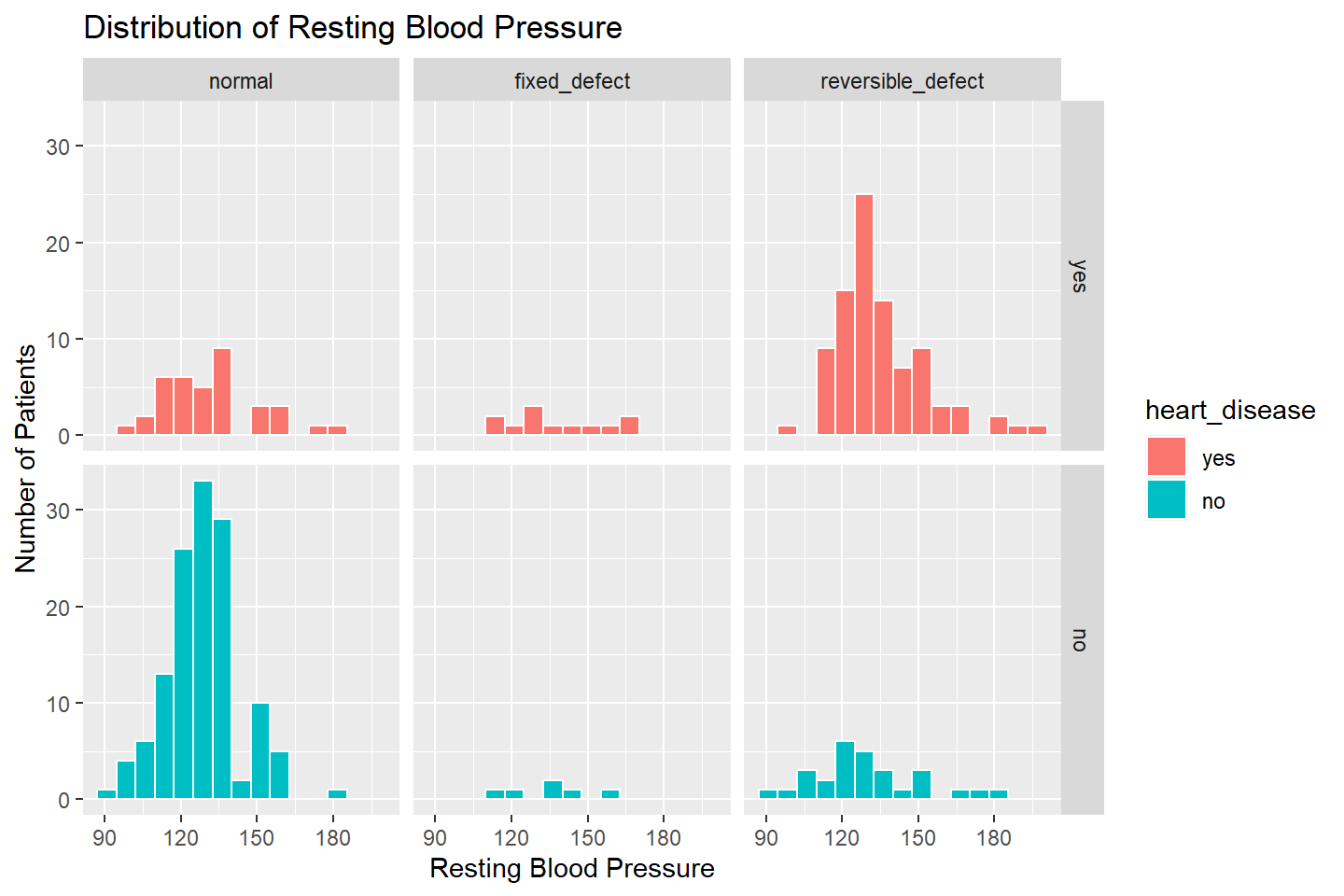
Density Histograms
Density histograms are used to determine whether a particular theoretical probability density function is a good fit to model the dynamics of that variable in a population. Unlike regular histograms, which provide counts of a numeric variable for a series of bins, density histograms provide the proportion of observations falling within a series of bins.
To create a density histogram, use the same syntax as when creating a
standard histogram, with the exception of adding
y = ..density.. into the aes() option.
# Density histogram of resting_blood_pressure
ggplot(data = heart_df, mapping = aes(x = resting_blood_pressure, y = ..density..)) +
       geom_histogram(fill = "#006EA1", color = "white", bins = 15) +
       labs(title = "Distribution of Resting Blood Pressure",
            x = "Resting Blood Pressure",
            y = "Proportion of Patients")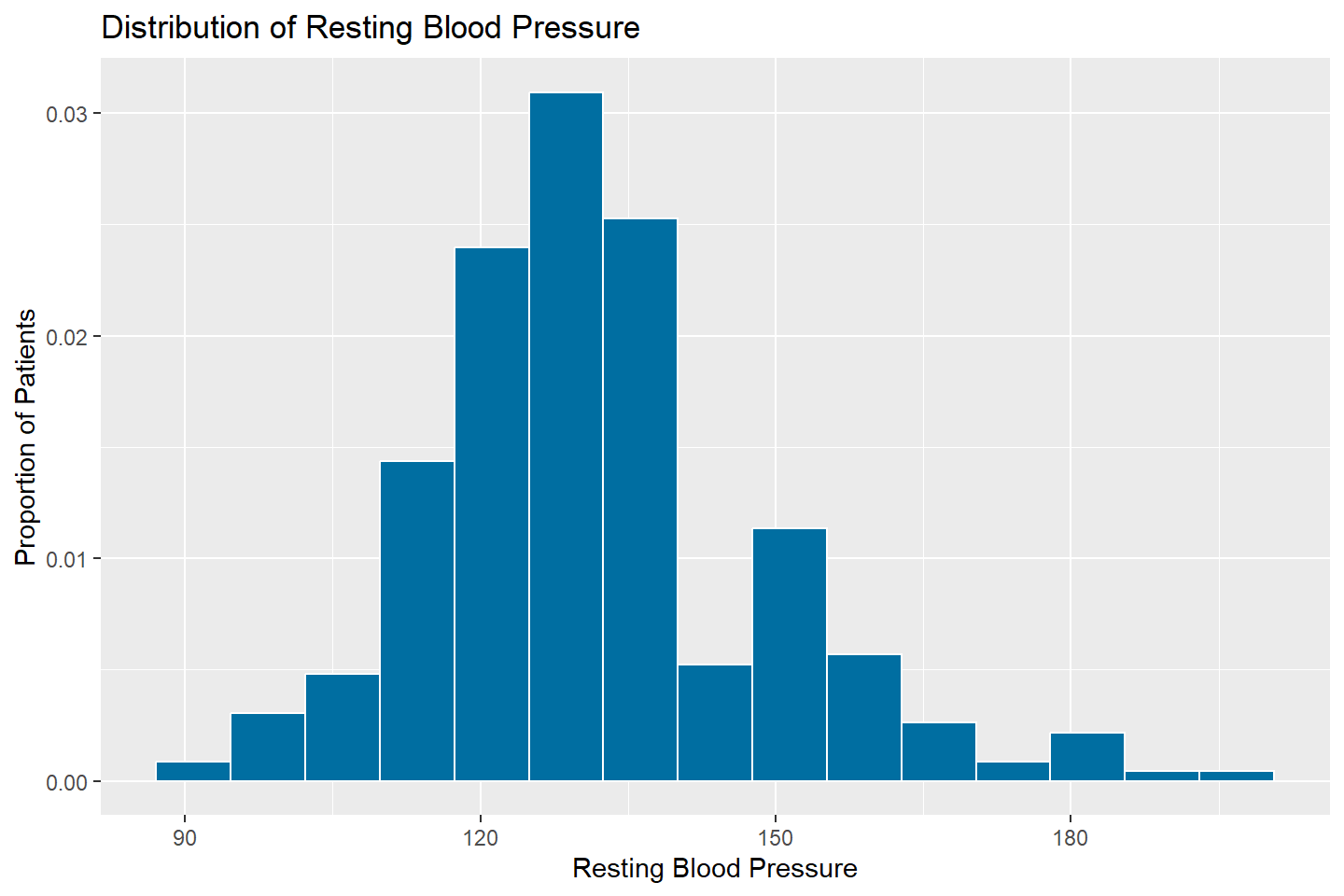
Boxplots
Box plots are a powerful tool for exploring the central tendency and
variability of numeric data by various levels of a factor or character.
In the examples below, we will produce boxplots with
ggplot().
The geom function used is
geom_boxplot().
For boxplots, the x argument in aes should
be a character or factor variable. The “Box” in boxplots represents the
IQR (25th - 75th percentiles of data values).
In the next couple of examples, let’s use the built-in data frame,
mpg which has data on over 200 cars and their associated
features such as city and highway miles per gallon.
mpg
The boxplot below visualizes the distribution of hwy
values by car class
# Box plots of "hwy" variable by "class"
ggplot(data = mpg, mapping = aes(x = class, y = hwy)) +
  geom_boxplot(fill = "#006EA1") +
  labs(title = "Boxplot of hwy by class", x = "Class of Vehicle",
       y = "Miles per Gallon Highway (hwy)")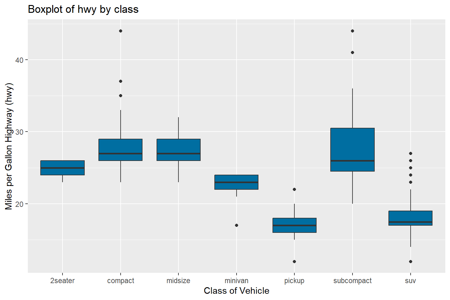
To color the boxplots by the level of a character or factor variable,
we must add this to the aesthetic mapping aes().
In the example below, let’s use the reorder() function
to sort the categories on the x-axis.
The reorder() function takes an optional third argument,
FUN, which is usually an aggregation function.
In the example below, we are reordering the class
categories on the x-axis by the median value of hwy within
each class category.
ggplot(data = mpg, mapping = aes(x = reorder(class, hwy, FUN = median),
                                 y = hwy, fill = class)) +
  geom_boxplot() +
  labs(title = "Boxplot of hwy by class",
       x = "Class",
       y = "Miles per Gallon Highway (hwy)")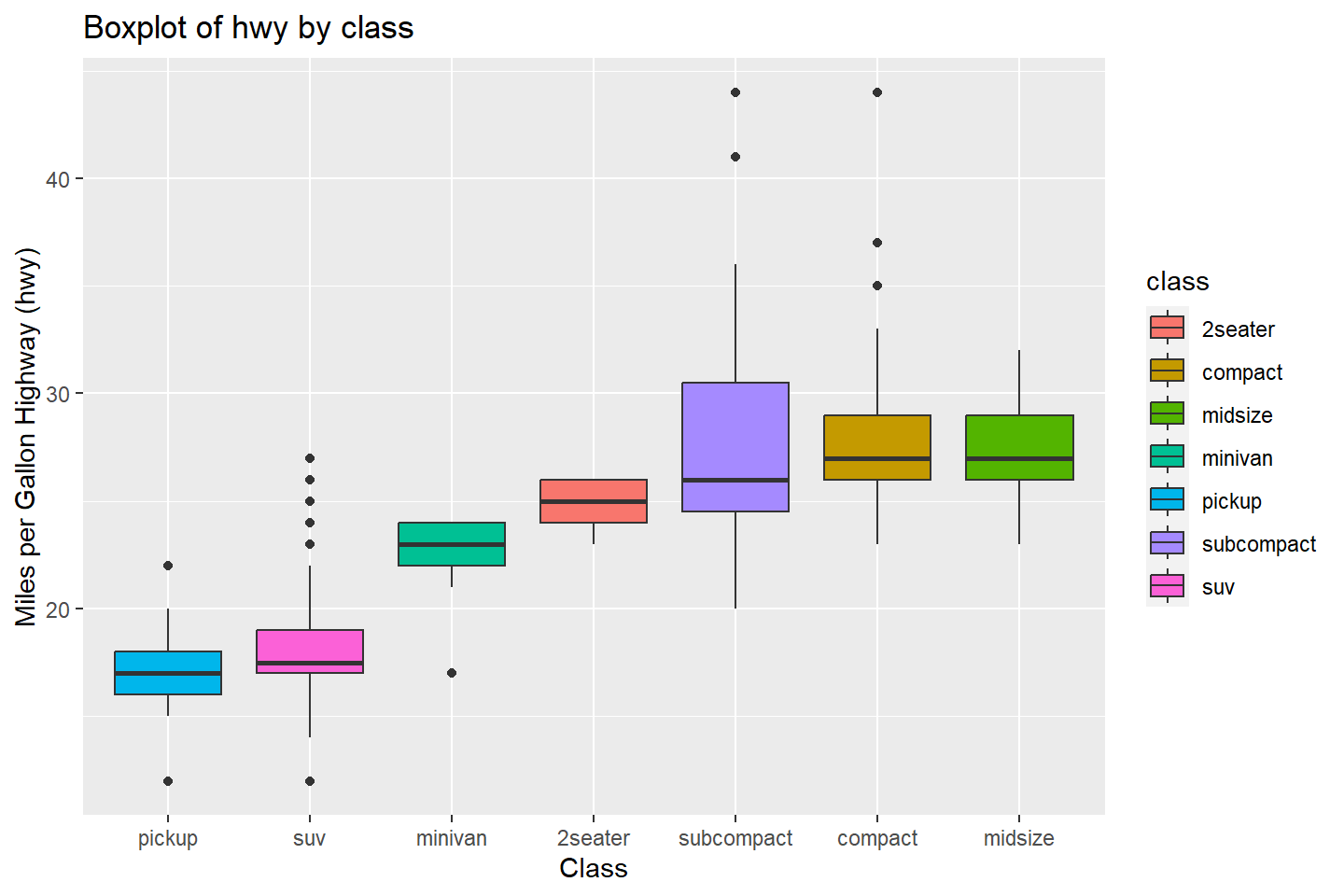
In cases where the factor of character variable has long labels, it
is useful to use the coord_flip() function to switch the
order of the axes in the plot. This is demonstrated below.
# Boxplot fill colors by "class" variable values and flip axes
ggplot(data = mpg, mapping = aes(x = reorder(class, hwy, FUN = median),
                                 y = hwy, fill = class)) +
  geom_boxplot() +
  labs(title = "Boxplot of hwy by class",
       x = "Class", y = "Miles per Gallon Highway (hwy)") +
  coord_flip()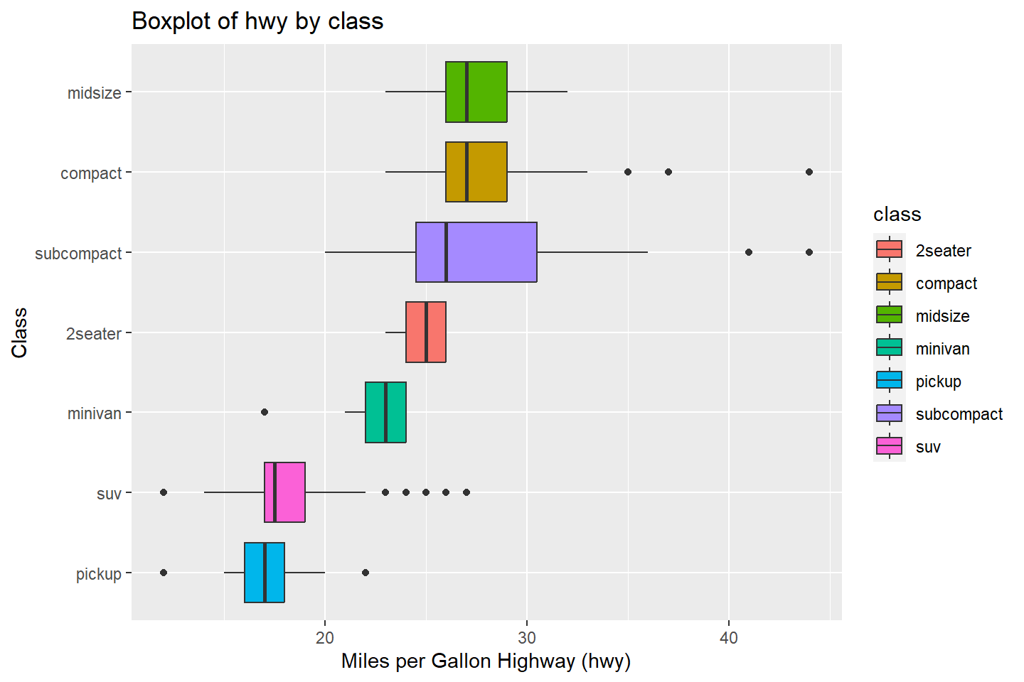
Violin Plots With Data Points
A violin plot is another way to visualize numeric variables by character or factor categories to study the numeric value distributions.
In ggplot2, the geom_violin() function
produces these plots. It is similar to a box plot except that instead of
displaying a box for the inter-quartile range (IQR), it display what’s
known as a kernel density estimate.
A kernel density estimate is simply an estimated probability density function that is plotted along the vertical axis of the plot, symmetrically on both sides.
The more this function sticks out (greater width), the more the original data points are located in that region of the y-axis.
This visualization is best combined with geom_jitter(),
which overlays the original data points onto the vertical axis. The
width argument gives the amount by which to scatter the
data points and the alpha argument provides the level of
color saturation (0.5 represents 50% of the completely filled data
points).
ggplot(data = mpg, mapping = aes(x = reorder(class, hwy, FUN = median),
                                 y = hwy, fill = class)) +
  geom_violin() +
  geom_jitter(width = 0.07, alpha = 0.5) +
  labs(title = "Violin Plot of hwy by class",
                        x = "Class", y = "Miles per Gallon Highway (hwy)")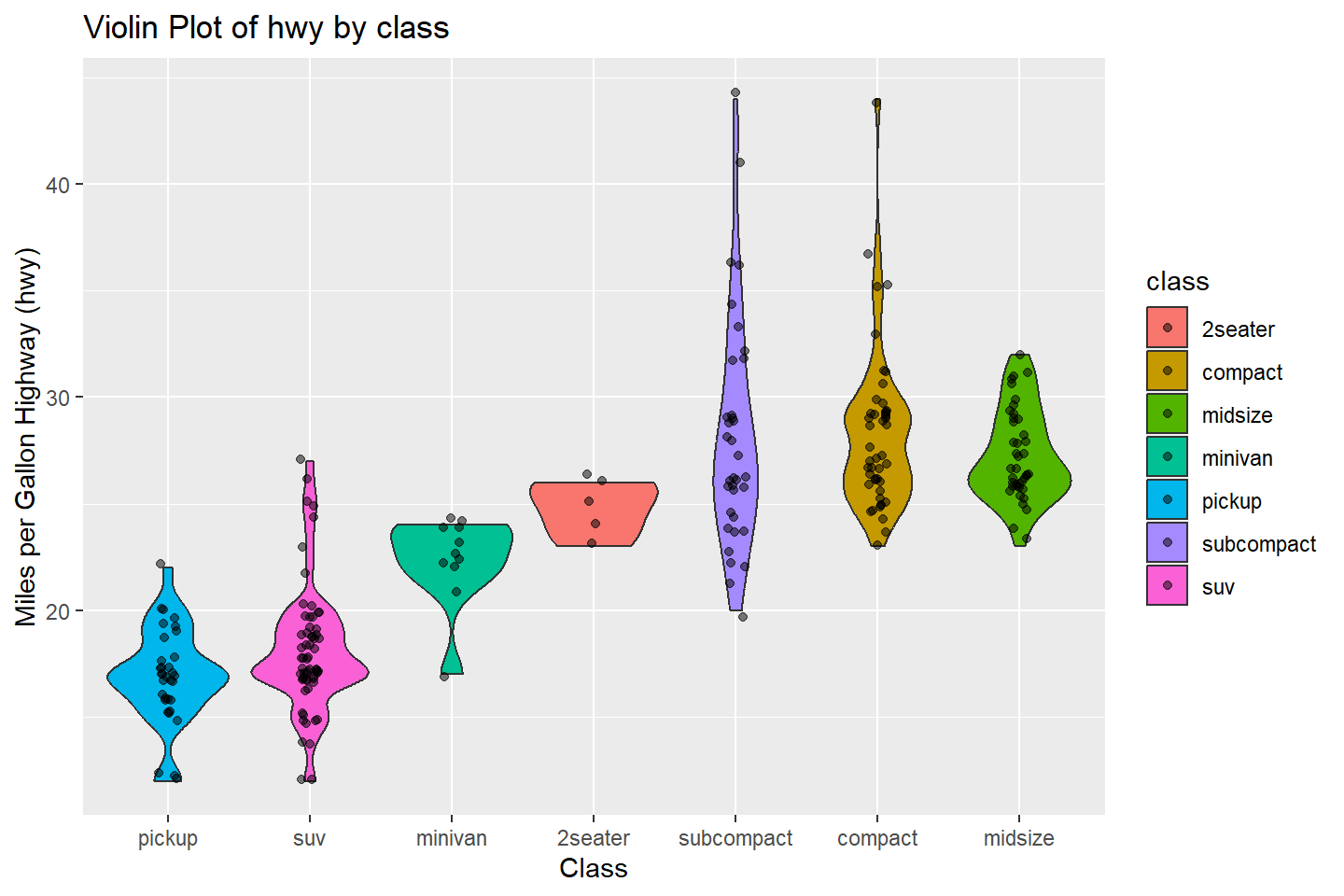
Line Charts
To create line charts, we use the geom_line()
function.
Let’s say we are interested in studying the average maximum heart
rate (max_heart_rate variable) and by patient
age. First, I will use dplyr to create a
summary data frame with this information.
heart_summary <-  heart_df %>% group_by(age) %>%
                  summarise(patients = n(),
                            avg_max_hr = mean(max_heart_rate)) %>%
                  arrange(age) %>%
                  filter(patients >= 5) # Keep Ages with at least 5 patients
# Let's take a look at the results
heart_summary
Simple Line Chart
Let’s plot a line chart with avg_max_hr on the y-axis
and age on the x-axis
ggplot(data = heart_summary, mapping = aes(x = age, y = avg_max_hr)) +
       geom_line(color = "#0072B2")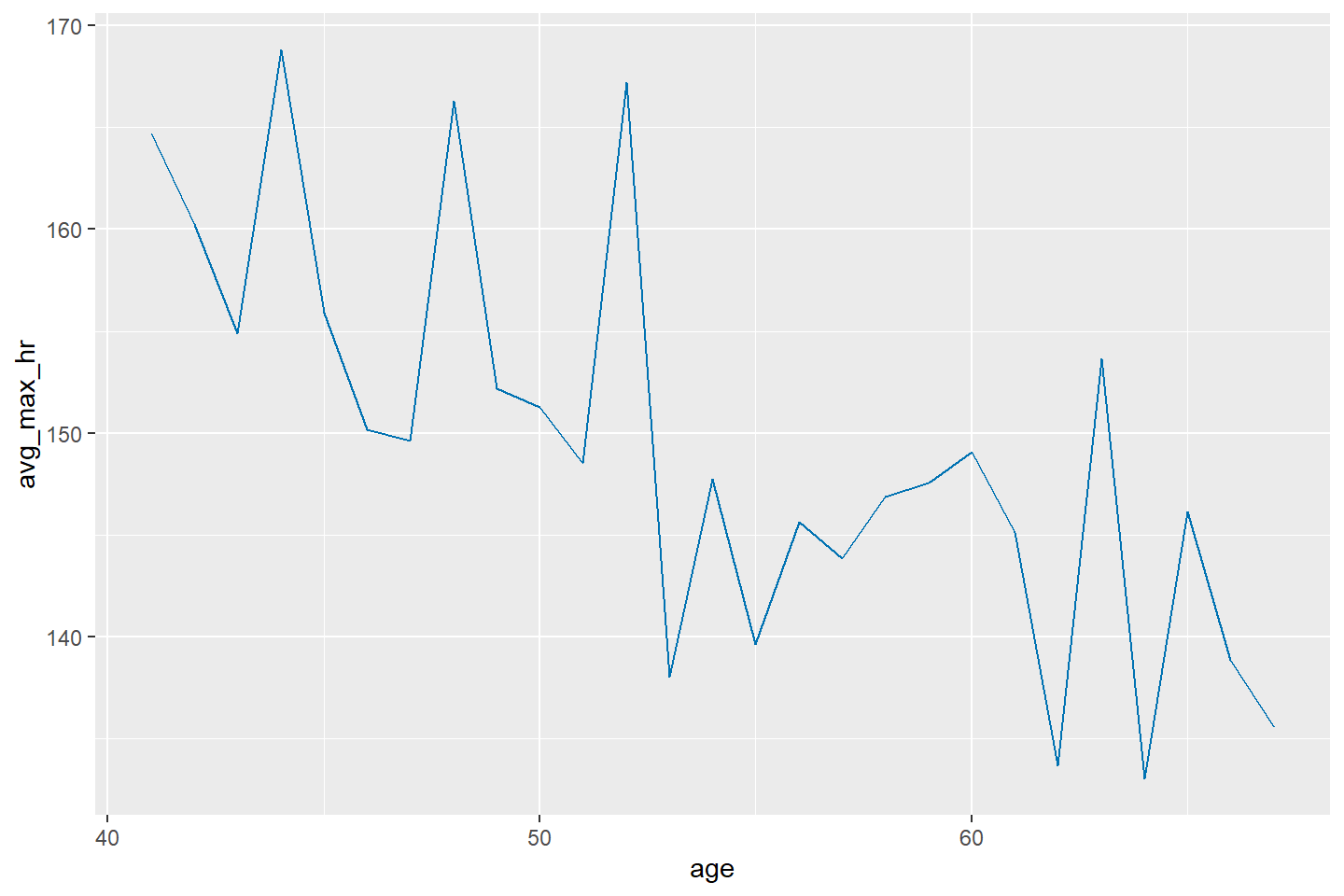
Now let’s include points in the line chart.
ggplot(data = heart_summary, mapping = aes(x = age, y = avg_max_hr)) +
       geom_line(color = "#0072B2") +
       geom_point(color = "#0072B2")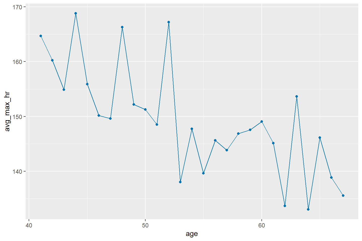
Finally, if you are not a fan of the default grey background in
ggplot2, just add theme_light() to the end of
any plot. There are many more themes available in ggplot2,
such as theme_bw(), or theme_classic(). Feel free to experiment with
them.
ggplot(data = heart_summary, mapping = aes(x = age, y = avg_max_hr)) +
  geom_line(color = "#0072B2") +
  geom_point(color = "#0072B2") +
  theme_light()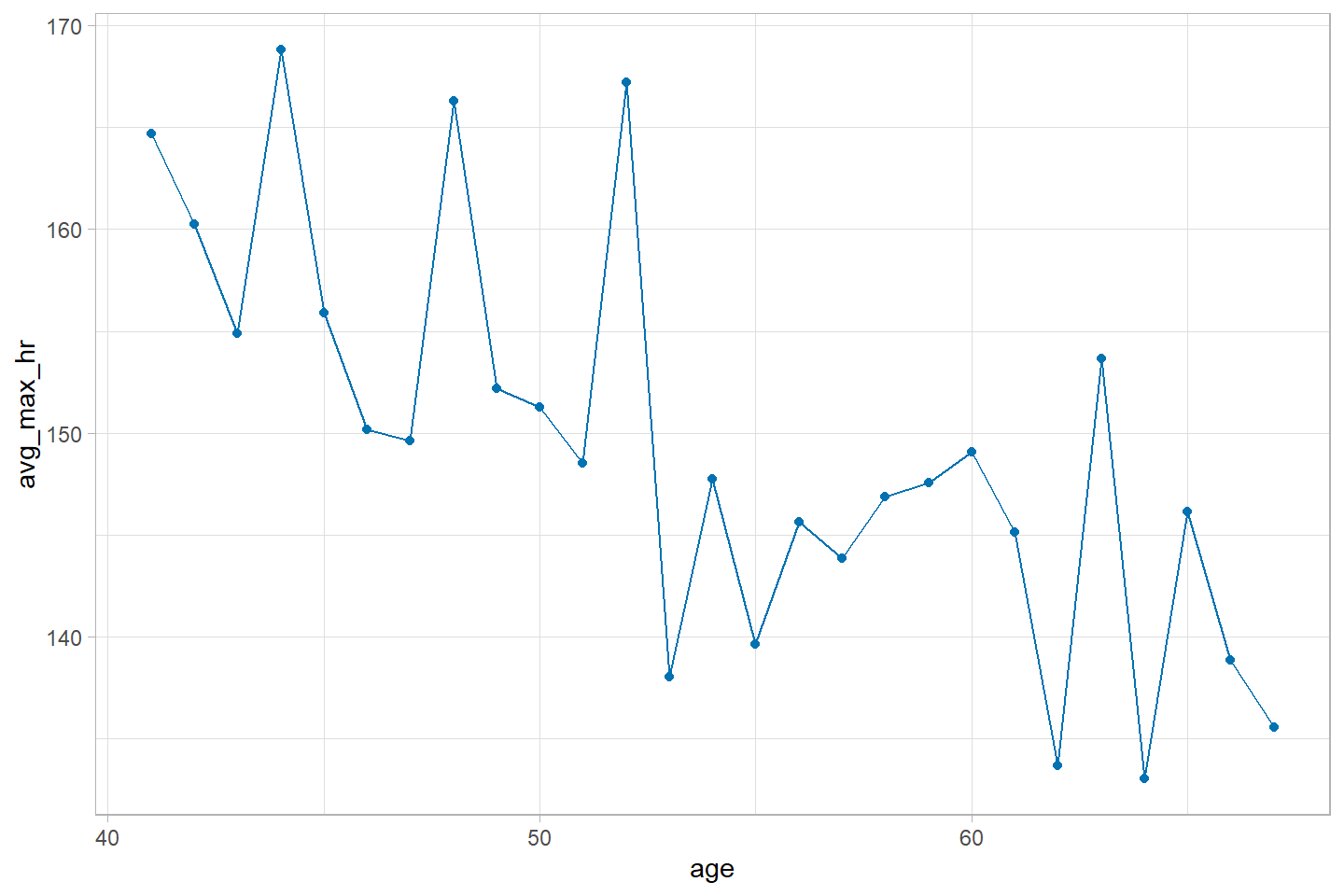
Learning More
To learn more about the advanced data visualization capabilities of
ggplot2 please see the ggplot2
documentation
Copyright © David Svancer 2023 |