Introduction to Classification
In this tutorial, we will learn about classification and logistic
regression with tidymodels. We will be using the
heart_disease dataset to demonstrate concepts in this
tutorial.
The heart_disease data contains demographics and
outcomes of various medical tests for patients in a heart disease study.
The variable of interest in this data is heart_disease and
it indicates whether a patient was diagnosed with heart disease (Yes or
No).
Click the button below to clone the course R tutorials into your DataCamp Workspace. DataCamp Workspace is a free computation environment that allows for execution of R and Python notebooks. Note - you will only have to do this once since all tutorials are included in the DataCamp Workspace GBUS 738 project.
![]()
The code below will load the required packages and data sets for this tutorial.
library(tidymodels)
library(vip)

# Heart disease data
heart_df <- readRDS(url('https://gmubusinessanalytics.netlify.app/data/heart_disease.rds')) %>%
            select(heart_disease, age, chest_pain, max_heart_rate, resting_blood_pressure)

# View heart disease data
heart_df
Introduction to Logistic Regression
In logistic regression, we are estimating the probability that our
Bernoulli response variable is equal to the
Positive class.
In classification, the event we are interested in predicting, such as
heart_disease = 'Yes' in our heart disease example, is
known as the Postive event. Whereas the remaining event,
heart_disease = 'No', is the Negative
event.
In our course tutorials, we will follow the model fitting process that is expected to be followed on the course analytics project. When fitting a classification model, whether logistic regression or a different type of algorithm, we will take the following steps:
- Split the data into a training and test set
- Specify a feature engineering pipeline with the
recipespackage - Specify a
parsnipmodel object - Package your recipe and model into a workflow
- Fit your workflow to the training data
- If your model has hyperparameters, perform hyperparameter tuning - this will be covered next week
- Evaluate model performance on the test set by studying the confusion
matrix, ROC curve, and other performance metrics
Let’s demonstrate this process using logistic regression and the
heart_df data.
Data Splitting
The first step in modeling is to split our data into a training and test set. In the classification setting, we must also make sure that the response variable in our data set is a factor.
By default, tidymodels maps the first level of a factor
to the Positive class while calculating performance
metrics. Therefore, before we split our data and proceed to modeling, we
need to make sure that the event we are trying to predict is the first
level of our response variable.
For the heart_df data, the event we are interested in
predicting is heart_disease = 'Yes'. We can use the
levels() function to check the current ordering of the
levels of the heart_disease variable.
levels(heart_df$heart_disease)[1] "yes" "no" Since ‘yes’ is the first level, we don’t need to take an further steps and can proceed to splitting our data.
In the code below, we use the initial_split() function
from rsample to create our training and testing data using
the heart_df data.
## Always remember to set your seed
## Add an integer to the argument of set.seed()
set.seed(345)

heart_split <- initial_split(heart_df, prop = 0.75,
                             strata = heart_disease)

heart_training <- heart_split %>% training()

heart_test <- heart_split %>% testing()
Feature Engineering
The next step in the modeling process is to define our feature
engineering steps. In the code below, we process our numeric predictors
by removing skewness and normalizing, and create dummy variables from
our chest_pain predictor.
When creating a feature engineering pipeline, it’s important to
exclude prep() and bake() because these will
be implemented automatically in our workflow that is created at a later
stage
heart_recipe <- recipe(heart_disease ~ ., data = heart_training) %>%
                step_YeoJohnson(all_numeric(), -all_outcomes()) %>%
                step_normalize(all_numeric(), -all_outcomes()) %>%
                step_dummy(all_nominal(), -all_outcomes())
However, it is always good practice to check that the feature
engineering recipe is doing what we expect. The code below processes our
training data with prep() and bake() so that
we can have a look at the results.
heart_recipe %>%
  prep(training = heart_training) %>%
  bake(new_data = NULL)
Model Specification
Next, we define our logistic regression model object. In this case,
we use the logistic_reg() function from
parsnip. Our engine is glm and our mode is
`classification.
logistic_model <- logistic_reg() %>%
                  set_engine('glm') %>%
                  set_mode('classification')
Create a Workflow
Now we can combine our model object and recipe into a single workflow
object using the workflow() function.
heart_wf <- workflow() %>%
            add_model(logistic_model) %>%
            add_recipe(heart_recipe)
Fit the Model
Next we fit our workflow to the training data. This is done by
passing our workflow object to the fit() function
heart_logistic_fit <- heart_wf %>%
                      fit(data = heart_training)
Exploring our Trained Model
Once we have trained our logistic regression model on our training
data, we can optionally study variable importance with the
vip() function.
The first step is to extract the trained model from our workflow fit,
heart_logistic_fit. This can be done by passing
heart_logistic_fit to the
extract_fit_parsnip() function.
heart_trained_model <- heart_logistic_fit %>%
                       extract_fit_parsnip()
Variable Importance
Next we pass heart_trained_model to the
vip() function. This will return a ggplot
object with the variable importance scores from our model. The
importance scores are based on the z-statistics associated with each
predictor.
We see from the results below, that asymptomatic chest pain, maximum heart rate, and resting blood pressure, are the most important predictors of heart disease from our data set.
vip(heart_trained_model)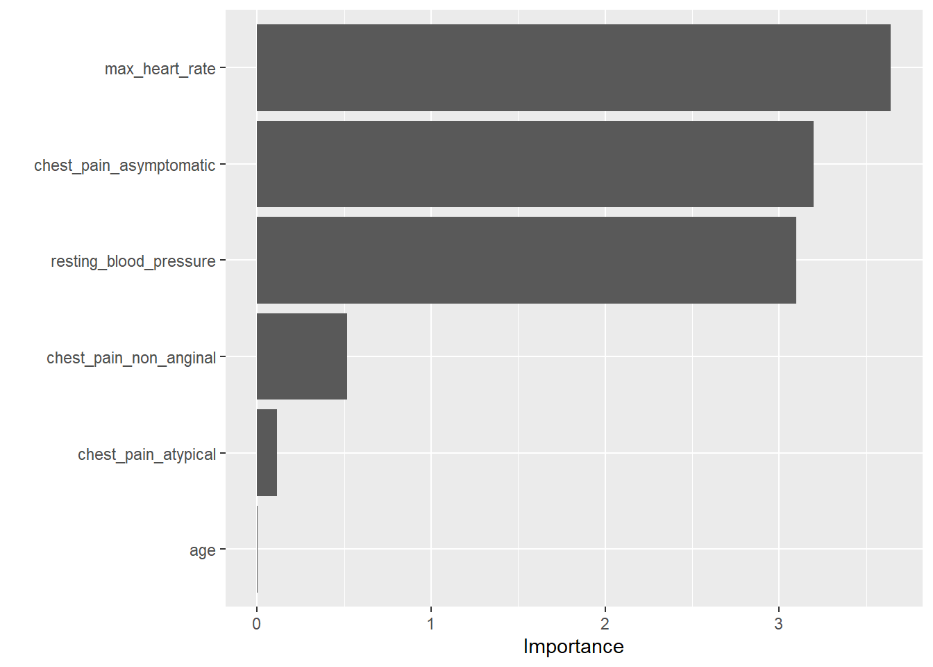
Evaluate Performance
The next step in the modeling process is to assess the accuracy of
our model on new data. This is done by obtaining predictions on our test
data set with our trained model object,
heart_logistic_fit.
Before we can do this, we create a results data frame with the following data:
- The true response values from our test set
- The predicted response category for each row of our test data
- The estimated probabilities for each response category
All of this data can be put together using the predict()
function.
Predicted Categories
To obtain the predicted category for each row in our test set, we
pass the heart_logistic_fit object to the
predict function and specify
new_data = heart_test.
We will get a data frame with a column named .pred_class
which has the predicted category (yes/no) for each row of our test data
set.
predictions_categories <- predict(heart_logistic_fit,
                                  new_data = heart_test)

predictions_categories
Next we need to obtain the estimated probabilities for each category of our response variable.
This is done with the same code as above but with the additional argument, `type = ‘prob’)
In this case we get a data frame with the following columns,
.pred_yes and .pred_no. The
tidymodels package will always use the following convention
for naming these columns
.pred_level_of_factor_in_response_variable
predictions_probabilities <- predict(heart_logistic_fit,
                                     new_data = heart_test,
                                     type = 'prob')

predictions_probabilities
The final step is to combine the results from above with the true response variable values in our test data set.
# Combine

test_results <- heart_test %>% select(heart_disease) %>%
                bind_cols(predictions_categories) %>%
                bind_cols(predictions_probabilities)

test_results
Exploring Performance Metrics
The yardstick package from tidymodels has a
number of functions for calculating performance metrics on the results
of a machine learning algorithm.
Important function from this package include conf_mat(),
sens(), spec(), roc_curve(), and
roc_auc()
All of these functions take a data frame with the structure of our
test_results as the first argument. The input data frame
must contain the three pieces of information mentioned at the beginning
of this section:
- The true response values from our test set
- The predicted response category for each row of our test data
- The estimated probabilities for each response category
Confusion Matrix
The first result to explore is usually the confusion matrix. The
conf_mat() function will produce one for us. It takes the
following important arguments:
data- the first argument is a data frame with model results (usually on the test set)truth- a factor column with the true response categoriesestimate- a factor column with the predicted response categories
The results of this function are a confusion matrix with the predicted categories in the rows and true categories in the columns.
By default, all yardstick functions map the first level
of the response variable to the positive class. The
conf_mat() function orders the output by displaying the
positive class first in both the rows and columns.
Form the results below, we have 58 correct predictions on our test data set. Since we have 76 rows in our test data, this gives us an accuracy of 76%.
We have 7 false positives (we predicted the positive class (‘yes’) but the truth was ‘no’) and 11 false negatives.
conf_mat(test_results,
         truth = heart_disease,
         estimate = .pred_class)
Truth
Prediction yes no
yes 24 7
no 11 34
Sensitivity
The sensitivity is a performance metric that calculates the proportion of actual positive cases that the classification model predicted correctly.
In our heart disease example, this is the proportion of patients who
developed heart disease (heart_disease = Yes) that were
predicted to develop heart disease.
The sens() function from yardstick is used
to calculate this metric. It takes the same arguments as
conf_mat().
From the results below, we have a sensitivity of 0.69 on our test data results.
sens(test_results,
     truth = heart_disease,
     estimate = .pred_class)
Specificity
The specificity is a performance metric that calculates the proportion of actual negative cases that the classification model predicted correctly.
In our heart disease example, this is the proportion of patients who
did not develop heart disease (heart_disease = No) that
were predicted to not develop heart disease.
The spec() function from yardstick is used
to calculate this metric. It takes the same arguments as
conf_mat().
From the results below, we have a sensitivity of 0.83 on our test data results.
spec(test_results,
     truth = heart_disease,
     estimate = .pred_class)
ROC Curve
The ROC curve is a way to visualize the performance of any classification model. The plot includes the sensitivity on the y-axis and (1 - specificity on the x-axis for all possible probability cut-off values.
The default probability cut-off value used by classification models is 0.5. But changing this can guard against either false positives or false negatives. The ROC curve plots all of this information in one plot.
What to look for: the best ROC curve is as close as possible to the point (0, 1) that is at the top left corner of the plot. The closer the ROC curve is to that point throughout the entire range, the better the classification model.
The dashed line through the middle of the graph represents a model that is just guessing at random.
The first step in creating an ROC curve is to pass our results data
frame to the roc_curve() function. This function takes a
data frame with model results, the name of the column with the true
outcome - truth, and the name of the column with the
estimated probabilities of the positive class, It will produce a data
frame with the specificity and sensitivity for all probability
thresholds.
roc_curve(test_results,
          truth = heart_disease,
          .pred_yes)
To plot this data, we simply pass the results of
roc_curve() to the autoplot() function.
roc_curve(test_results,
          truth = heart_disease,
          .pred_yes) %>%
  autoplot()
Area Under the ROC Curve
Another important performance metric is the area under the ROC curve. This metric can be loosely interpreted as a letter grade.
In terms of model performance, an area under the ROC value between 0.9 - 1 indicates an “A”, 0.8 - 0.9 a “B”, and so forth. Anything below a 0.6 is an “F” and indicates poor model performance.
To calculate the area under the ROC curve, we use the
roc_auc().
This function takes the results data frame as the first argument, the
truth column as the second argument, and the column of
estimated probabilities for the positive class as the third
argument.
From our results below, our model gets a “B”.
roc_auc(test_results,
        truth = heart_disease,
        .pred_yes)
F1 Score
The F1 score is a performance metric that equally balances our false positive and false negative mistakes. The range of an F1 score is from 0 (worst) to 1 (best).
The f_meas() function from yardstick is
used to calculate this metric. It takes the same arguments as
conf_mat().
From the results below, we have an F1 score 0.73 on our test data results.
f_meas(test_results,
       truth = heart_disease,
       estimate = .pred_class)
Creating Custom Metric Sets
It is also possible to create a custom metric set using the
metric_set() function. This function takes
yardstick function names as arguments and returns a new
function that we can use to calculate that set of metrics.
In the code below we create a new function, my_metrics()
that will calculate the accuracy, sensitivity, specificity,
F1, and ROC AUC from the results data frame.
Note: Since accuracy(),
sens(), spec(), and f_meas()
require the truth and estimate columns while
roc_auc() requires the truth column and a
column of estimated probabilities for the positive class, all three must
be provided to the custom function when it is called.
my_metrics <- metric_set(accuracy, sens, spec, f_meas, roc_auc)

my_metrics(test_results,
           truth = heart_disease,
           estimate = .pred_class,
           .pred_yes)
Automating the Process
Just like with linear regression, we can automate the process of
fitting a logistic regression model by using the last_fit()
function. This will automatically give use the predictions and metrics
on our test data set.
In the example below, we will fit the same model as above, but with
last_fit() instead of fit().
The last_fit() function takes a workflow object as the
first argument and a data split object as the second. It will train the
model on the training data and provide predictions and calculate metrics
on the test set.
The last_fit() function takes an optional
metrics argument where a custom metric function can be
provided. In the example below, we use our my_metrics()
function. If this is left out of the call to last_fit(), it
will calculate accuracy and ROC AUC by default.
last_fit_model <- heart_wf %>%
                  last_fit(split = heart_split,
                           metrics = my_metrics)
To obtain the metrics on the test set (accuracy and roc_auc by
default) we use collect_metrics().
last_fit_model %>%
  collect_metrics()
We can also obtain a data frame with test set results by using the
collect_predictions() function.
last_fit_results <- last_fit_model %>%
                     collect_predictions()

last_fit_results
We can use this data frame to make an ROC plot by using
roc_curve() and autoplot().
last_fit_results %>%
  roc_curve(truth = heart_disease, .pred_yes) %>%
  autoplot()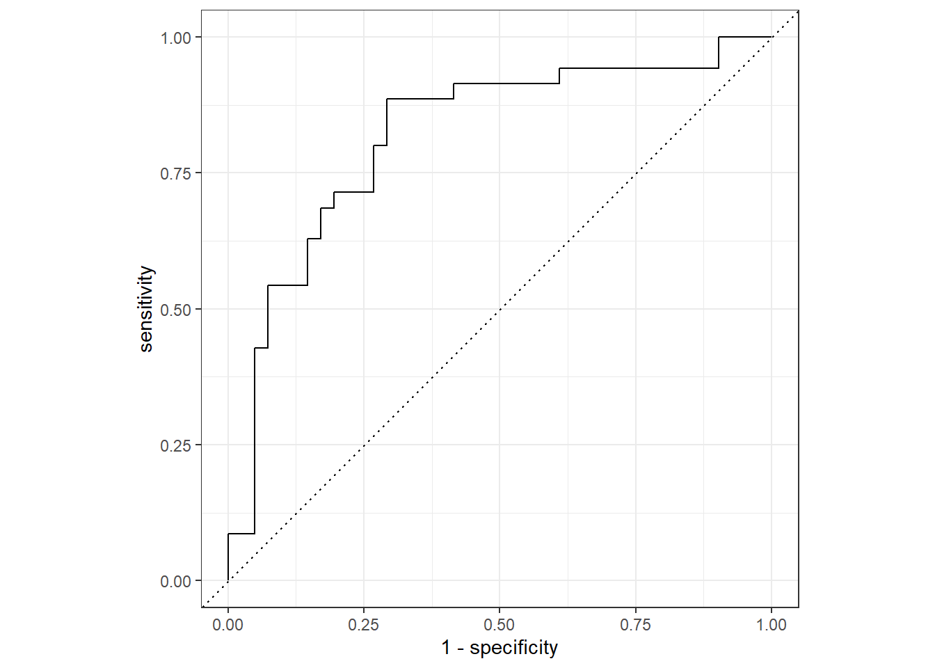
Copyright © David Svancer 2023 |